Thursday
Feb232017

Campaigning with CAGE

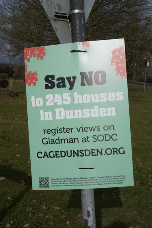
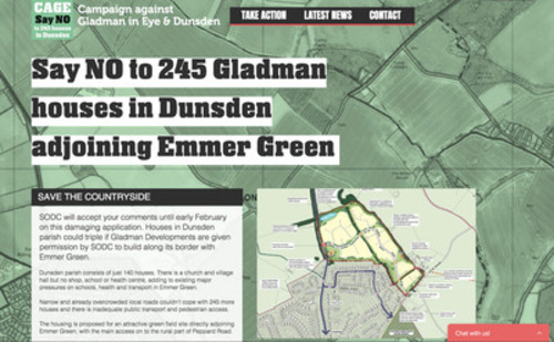
Design for Print developed a website and campaign posters for the Camapign Against Gladman in Eye & Dunsden. Robust typography, bold copy and strong colours against a green background that symbolises the Oxfordshire countryside all helped create awareness of the defects of a plan for 245 unsustainable houses next to the beuatiful Chilterns AONB. 

A responsive website integrated with the posters drove Oxfordshire residents to their local council website where almost 500 comments against the development were registered. The campaign also made use of a new Facebook page on which to contine the story.

Tuesday
Mar152016

Celebrating Wilfred Owen


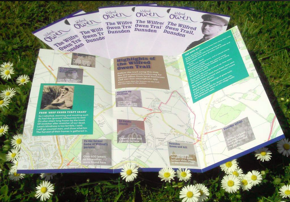
The WW1 poet Wilfred Owen spent a year and a half living in Dunsden in South Oxfordshire. Design for Print was asked to design an exhibition, interpretation board and a trail leaflet to help the community celebrate this connection.

The exhibition

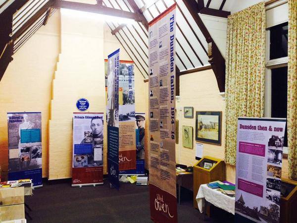
Held over a weekend in the former school hall where Wilfred Owen once taught. Using bold areas of flat colour and a silhouette of soldiers on the battlefield together with period typography, the display was a big success with visitors, many of whom recorded positive comments in a specially kept visitors' book. The exhibition featured a number of lightweight fabric banners together with a set of pop-up stands which were designed to be easily transported to different venues. It subsequently toured to a number of local schools.

Trail icon

Design for Print also produced an icon for the Dunsden Owen Association's smartphone app which integrated with other design work for the Association. A full range of sizes was produced and tested for both Apple and Android devices.

Interpretation board and leaflet

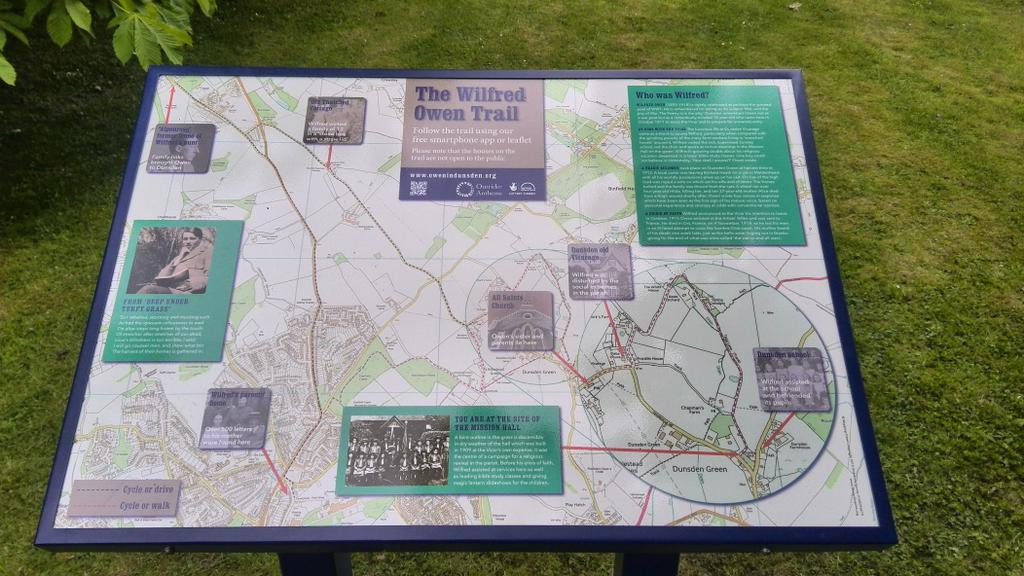
Finally an interpretation board and trail leaflet were produced for the Association.

Tuesday
May122015

Complex issues for Dextra


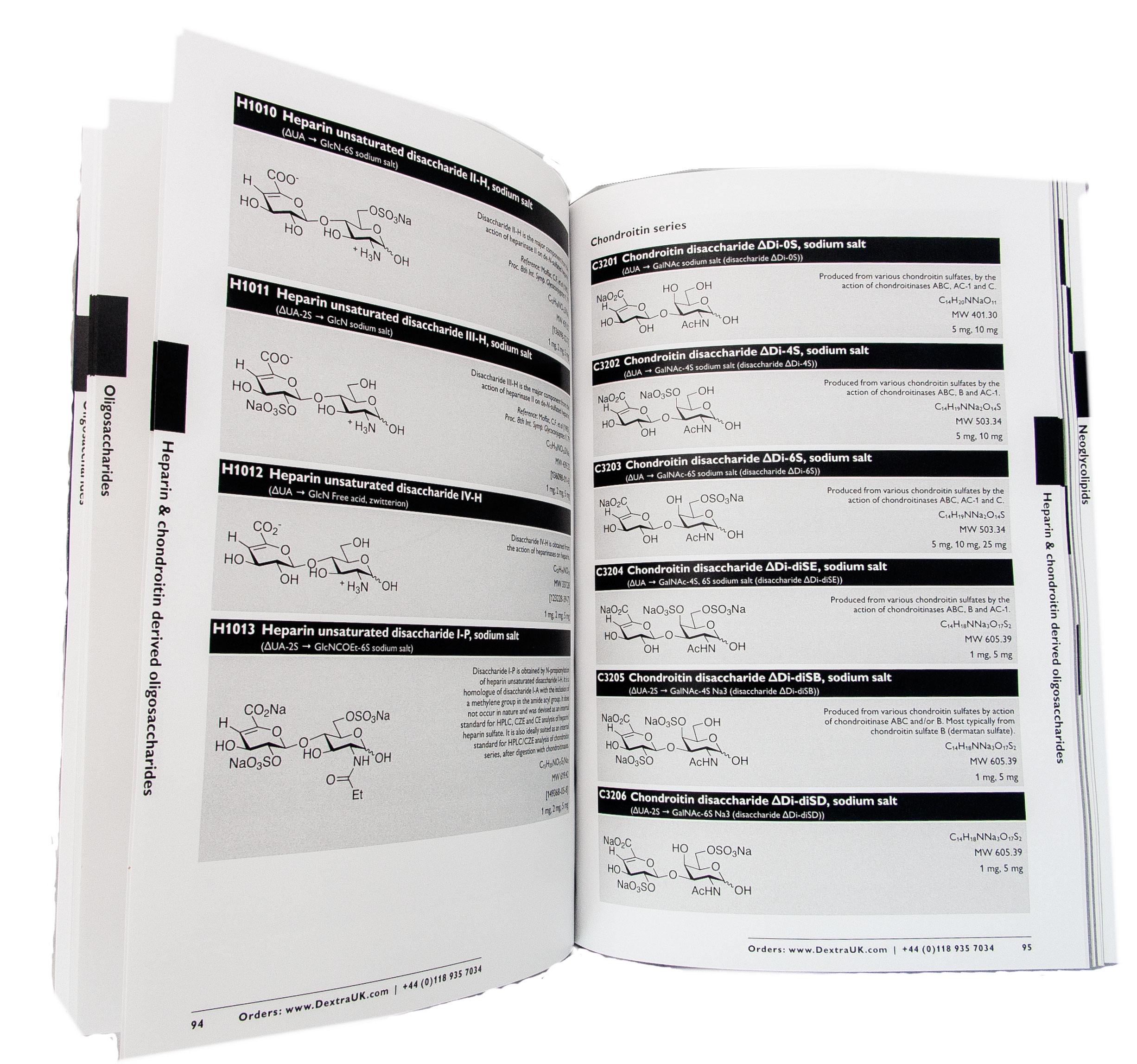
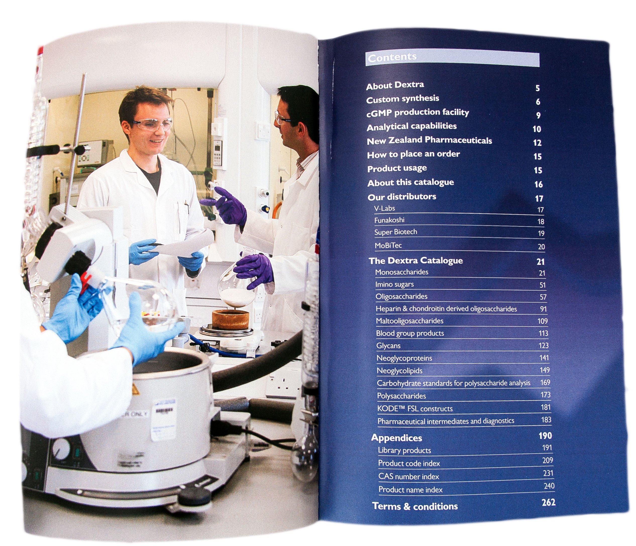
The Dextra catalogue is a complex 248 page A5 book which showcases the carbohydrate chemical products of the Reading-based company. Design for Print has worked for them for over 20 years, updating the company logo and producing a range of marketing materials.

The catalogue required very careful attention to detail, illustration skills and photo retouching skills, and endless patience as thousand of chemical structures were typeset efficiently and accurately.

Thursday
Jul052012

Going Down by the River with Two Rivers

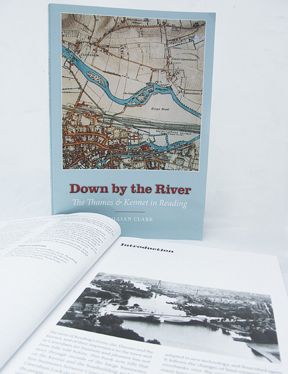
Working with local author Gillian Clark, Design for Print designed and created her history of the River Thames at Reading which was published by busy Reading publishers Two Rivers Press. Besides establishing a format, cover design and page layout, we also contributed some photographs and suggested a title for the publication.

There's an extra  personal connection for Design for Print. The father of author Gillian Clark saved the uncle of DFP's David Woodward from drowning in the Thames. He was an actor called Ronald Allen went on to become a household name in the 1970s and 80s.

Tuesday
Jul032012

A busy few months for Design for Print

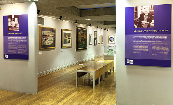
Exhibition design work for the River & Rowing Museum, Henley-on-Thames, the World Rugby Museum, Twickenham and Abingdon's newly re-furbished County Hall have all been produced in 2012.

In Henley the show, which remains open until the autumn, celebrates the work of the artist John Piper.